This is the original image that I took The image was taken in black and white (grey scale effect on a 'Sony Ericsson' phone). I started smudging out the background but this didn't look that professional so I thought it would be better to use the eraser tool and erase the whole background.
I started rubbing out the background and to do this in a way that I would be able to rub out the background completely I made a new layer and filled it in red to make sure I could see the small detail of background that needed to be rubbed out around the model.
As you can see there are cloudy areas around the body of the model, I changed the red background to maroon so that I could see the cloudy areas even clearer and therefore rub them out.
This is a print screen shot of when I had finished rubbing out all of the background.
I then got rid of the maroon layer and added back the other layers of my text and boxes.
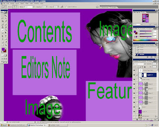
I added my other model's picture into the contents page, I had also rubbed out the background in the same way so I didn't think it was necessary to print screen all of the steps again as you can see I know how to rub the background out.
I free transformed both the images to make them fit into the page nicely.
I made a duplicate layer of the female model so that I could make her face black and white by lowering the saturation to -100, I did this so that on the other duplicate I could make her make up stand out against the black and white image thus making it more dramatic.
This is a print screen shot of the other duplicate layer on top of the black and white layer, showing the colourful make-up and making it stand out.
Then I changed the hue and saturation to make the make-up look brighter, and I also made the black and white layer darker by changing the levels this made the contrast stronger.

Finally I filled the background in purple to make the flat plan look better.
If I end up using this layout as my final one I will make the background a different colour and make it look more professional, this was just a rough flat plan to show an idea of what I may want my contents page to look like


No comments:
Post a Comment