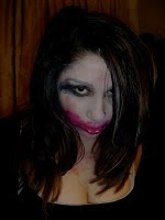
The second layout I create is simple and follows certain conventions of a hip-hip magazine such as the image used is of one model and this is the main focus of the magazine, the image has an anchor which makes the audience intrigued about the model therefore they will want to read more. The kickers are all positioned on the right hand side which is unconventional but I have positioned them like this to make the cover look simple and not too busy. The masthead is positioned on the top but left hand side as opposed to the center this is unconventional, The issue number is underneath the masthead and is kept small so that it is not a distraction, the date line is positioned on the left hand side underneath the masthead and is also kept small for the same reason. The bar-code is in the bottom right hand corner therefore it will not be a distraction, this is good as the audience should concentrate on the more important things on the magazine such as the image and the kickers. The magazine cover has a skyline and a banner which will let the reader know a bit more about what and who the magazine features, the skyline will have celebrities names on it and the banner will have what the magazine is about: 'The best in Urban Entertainment- Music, Gossip, Fashion, News and Reviews'.
This magazine cover layout was not the best choice as it doesn't follow all of the conventions of a hip-hop magazine and there are some empty spaces which I felt did not look that professional therefore I did not choose this layout for my magazine.


No comments:
Post a Comment