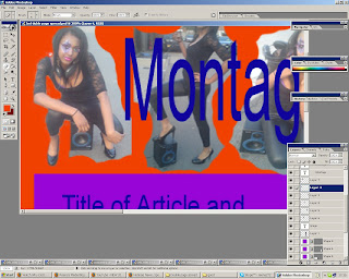
The first double page spread I created was quite a complicated layout. I included a montage so that the audience got to see a variety of images, there is also a big image on the second page of the double page spread this is so the audience can also see a close up of the artist and it also gives the pages some volume and a different feel. This image will have a quote across it to draw the readers in because if they see a funny or interesting quote they will be curious and want to read on. The images are all of the artist holding/sitting with props related to music either headphones or a speaker, this is to make it clear that she is a music artist. Her image is very young and funky as her clothes are sexy and her make-up is bright and vibrant. I choose to erase all of the backgrounds on each picture and make a montage because I thought it looks interesting and funky.
There is a small introduction to the article so that the readers can get to know a bit about the new artist and what the interview will have in store for them before they continue to read the article. The article itself is written in columns as I have shown with the boxes, this is so that it is easy for my audience to read and it doesn’t look like too much text if it is split into columns rather than just one big article. The colours I am going to use in the real double page spread will be more professional looking than the colours used in the flat plan, the reason I used these colours at the moment is to colour code everything included in the flat plan and make the plan look clearer. The magazine name and institutional logo is in the top left hand corner and the page number is in the bottom right corner, this is so that the audience are not distracted by these small details and so that they focus on the article and images. The spine does not interfere with any of the text or images which is good as it will easy for the audience to read and see everything clearly.
This is a print screen shot of how I erased the backgrounds on the images for the montage.
Sunday, 18 April 2010
Subscribe to:
Post Comments (Atom)


No comments:
Post a Comment