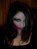
 This is my final front cover, I decided to leave the button out as there is not enough space and I didn't want to cover the models hand as this wouldn't look professional and would also overcrowd the front cover, instead I chose to add a button to the contents page saying 'Free Mixtape inside'
I decided to use a dark background 'dark metal', it looks cool and slick, everything will stand out better against a dark and not busy background but it still has texture to it as it has a metal effect. I then added my masthead in a bold typeface that I choose on Dafont.com I changed the colour of the masthead to a light blue/purple as I thought it contrasted well against the grey background. I also added a purple box around it and changed the opacity so that it is almost transparent. I duplicated the layer of my masthead, placed it underneath the original masthead and changed the colour to add a shadow effect to my masthead. I chose a simple typeface for the skyline on photoshop and I added a box across the top of the page as the skyline to make it look more professional rather than just having text. I added a teaser saying 50 VS Ross, I chose this font from Dafont.com as I looked it looked perfect for a hip-hop magazine teaser about fights/beef because it looks very masculine and I chose the colour grey because it works well with the whole colour scheme. I tilted the teaser on its side to make the magazine cover have some variety rather than everything being vertical.


I added a kicker on top of the barcode saying '20 hottest summer singles', '20' is in white to add more variety rather than the whole kicker being in one colour and it also draws the readers eye to the number which will encourage them to keep reading on. Then I added the website in small, simple font to keep it out of the way as it is not as important as the other main images and text. Finally I added two more kickers/cover lines. One is about Nicki Minaj and one is about KR Saviour, they are both in blue and white to keep the colour scheme going throughout and the whole colour scheme works well together. The KR Saviour kicker has a transparent purple box behind it to make it stand out even more because this is my main double page spread story.
No comments:
Post a Comment