Thursday 29 April 2010

Magazine Double Page Spread (Final)


This is the final double page spread I created for my hip-hop magazine.


I added a quotation but i removed this because i felt that i did not look professional as it made the page look over crowded.

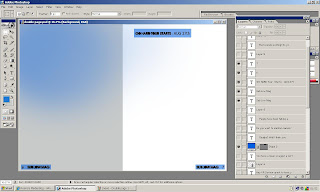
Process of making it:


I started off with a grey side and a white side of the double page spread, I used the gradient tool to add blue onto the grey side as I thought this looked much more appealing. Then I added blue transparent boxes with text on top of them this was for the page numbers and the live tour date information, the blue boxes made them stand out more and this has been a house style throughout my magazine and so is the use of this particular blue colour. I then added the Title of the article and the introduction also using the same colour scheme of grey, white and blue to keep it all matching, I chose these colours in particular because they match the models clothes which makes the magazine seem very professional as everything is working together. Then I added the images that I had previously edited on photoshop with hue and saturation and auto levels and the eraser tool. Finally I added all of the article which is the main text. I got the font from Dafont.com and changed the colour of the font, and added a quotation on top of the black and white image but then I removed this because I didn't think it looked professional and it was unnecessary. I also free transformed the black and white image to lengthen it and make it in line with the text, then I added some final touches to the other images such as on the image with the 'nerd' glasses I smudged the lamppost to get rid of a little white mark, little things like this made the images look much more professional yet still 'street'.

No comments:

Post a Comment