Sunday 2 May 2010

Feedback


This is some of the feedback I got on facebook.com where I uploaded my magazine project. My model commented that it would have been better if we had used a camera (rather than a camera phone) which agree with, next time I will invest in a good quality camera as I would have liked to do that this time. You can tell that my feedback is from hip-hop fans as they use slang that people from that genre of music would use.

There was some constructive criticism about the grey boxes but other than that there was positive feedback as people liked the image a lot!


I got a lot of positive feedback on the double page spread and this seemed to be everyone's favourite. You can tell that the feedback is from hip-hop fans by the kind of slang they are using and their clothes on their profiles, therefore I would listen to their ideas to make my magazine better next time.

Evaluation


Thursday 29 April 2010

Magazine Double Page Spread (Final)


This is the final double page spread I created for my hip-hop magazine.


I added a quotation but i removed this because i felt that i did not look professional as it made the page look over crowded.

Process of making it:


I started off with a grey side and a white side of the double page spread, I used the gradient tool to add blue onto the grey side as I thought this looked much more appealing. Then I added blue transparent boxes with text on top of them this was for the page numbers and the live tour date information, the blue boxes made them stand out more and this has been a house style throughout my magazine and so is the use of this particular blue colour. I then added the Title of the article and the introduction also using the same colour scheme of grey, white and blue to keep it all matching, I chose these colours in particular because they match the models clothes which makes the magazine seem very professional as everything is working together. Then I added the images that I had previously edited on photoshop with hue and saturation and auto levels and the eraser tool. Finally I added all of the article which is the main text. I got the font from Dafont.com and changed the colour of the font, and added a quotation on top of the black and white image but then I removed this because I didn't think it looked professional and it was unnecessary. I also free transformed the black and white image to lengthen it and make it in line with the text, then I added some final touches to the other images such as on the image with the 'nerd' glasses I smudged the lamppost to get rid of a little white mark, little things like this made the images look much more professional yet still 'street'.

Wednesday 28 April 2010

Magazine Contents Page (Final)

This is the contents page I created for my magazine, Sub low.

Monday 26 April 2010

Magazine Front Cover (Final)

This is my final front cover, I decided to leave the button out as there is not enough space and I didn't want to cover the models hand as this wouldn't look professional and would also overcrowd the front cover, instead I chose to add a button to the contents page saying 'Free Mixtape inside'
I decided to use a dark background 'dark metal', it looks cool and slick, everything will stand out better against a dark and not busy background but it still has texture to it as it has a metal effect. I then added my masthead in a bold typeface that I choose on Dafont.com I changed the colour of the masthead to a light blue/purple as I thought it contrasted well against the grey background. I also added a purple box around it and changed the opacity so that it is almost transparent. I duplicated the layer of my masthead, placed it underneath the original masthead and changed the colour to add a shadow effect to my masthead. I chose a simple typeface  for the skyline on photoshop and I added a box across the top of the page as the skyline to make it look more professional rather than just  having text. I added a teaser saying 50 VS Ross, I chose this font from Dafont.com as I looked it looked perfect for a hip-hop magazine teaser about fights/beef because it looks very masculine and I chose the colour grey because it works well with the whole colour scheme. I tilted the teaser on its side to make the magazine cover have some variety rather than everything being vertical.

I then used the texturizer filter to make it have a stone kind of effect which I thought would attract my target audience as it is unique. I then used auto levels to brighten up the page as you can see the '50 vs Ross' teaser stands out.

I added my selling line underneath the masthead on the right hand side and I used a simple typeface in white to make it stand out against the grey background. On the left hand side underneath the masthead I added the dateline also in a white, simple typeface, I think that it stands out well against the dark background and I emphasised the word 'May' as I made it bold too. Both the selling line and dateline have inserted a purple/dark blue box behind them both and made the opacity less to make it transparent. I also added a banner saying 'The number 1 selling hip-hop magazine' in a white, simple typeface with a purple transparent box behind it.

I added the image in and it fitted nicely because of the way I had positioned all of the text around it. The image was edited on photoshop as I changed the auto levels, auto contrast and auto brightness to make the colours in the image stand out more and this gives it a more professional look. I also added a white box in the bottom right hand corner and added a bar-code on top of it with a font from Dafont.com.

I added the anchor in with different typefaces, which were all chosen from Dafont.com, I chose to use this blue colour as I thought it looked funky and cool which will attract my target audience. I added a transparent purple box around it and the edges of the box out to make it fit in better and have a more professional look.


I added a kicker on top of the barcode saying '20 hottest summer singles', '20' is in white to add more variety rather than the whole kicker being in one colour and it also draws the readers eye to the number which will encourage them to keep reading on. Then I added the website in small, simple font to keep it out of the way as it is not as important as the other main images and text. Finally I added two more kickers/cover lines. One is about Nicki Minaj and one is about KR Saviour, they are both in blue and white to keep the colour scheme going throughout and the whole colour scheme works well together. The KR Saviour kicker has a transparent purple box behind it to make it stand out even more because this is my main double page spread story. 

Thursday 22 April 2010

History of magazines

This is a time-line I devised of the history of magazines, it shows the background of what magazines were used for originally and how they have developed through the decades.

Conde Nast

Magazine Case
Study
Throughout this case study I am going to be exploring a magazine from the company Conde Nast which is an international magazine publishing house. Conde Nast is one of the biggest and most successful publishers in the world.


“Home to many of the worlds celebrated magazines and websites, is committed to journalistic integrity, influential reporting and superior design. Each of our magazines features renowned editors, writers and photographers”


Some of their magazines include:                                              
                                                                      
• W                                                            

• Style.com

• Glamour

• Allure

• Self

• Teen Vogue

• GQ

• Vogue


I am doing my magazine case study on Vogue. Vogue is a magazine that specialises in fashion and lifestyle. The cover models are usually young girls and young celebrity men; this catches the audiences’ attention. It will draw them in and will make them want to read the magazine, especially if their favorite celebrity is on the front cover as X Factor judge, Cheryl Cole's cover appearance boosted circulation to 240000 .Vogue is available in sixteen different countries including Australia, Brazil, Latin America, Korea, Japan, Russia, Spain, USA, UK, France, China, Germany, Greece, India, Portugal and Taiwan. Its main focus is to provide monthly updates on fashion and lifestyle advice.

How are magazines produced?

All magazines follow a really simple process of production. The first step is having an editorial meeting at the beginning of each month, at this meeting the feature ideas are discussed with the features editor, fashion editor and design editor. Following the meeting a decision is made about who is going to be commissioned to be the writer, photographer and designer. Other processes include trying to decide how many pages will be needed “the advertising team decides how much space they will need to sell in order to make up the amount of income they are required to generate” If they don’t sell enough advertising they have to consider how they can reduce their costs, one way of doing this is to reduce the number of pages in the magazine.

The Keys roles of production:

• Editor who keeps an overview of running the magazine, responding to and producing ideas.
• Features editor who oversees the production of copy from writers, comes up with ideas for features and supports the writing team with knowledge and imagination.
• The writer comes up with ideas or runs with suggested ideas. E.g. investigative writer, news writer ect.
• The sub-editor checks copy for consistency, clarity, representation of facts. They are responsible for ensuring that the magazine is as intended and to a high standard.
• The art editor oversees all the artwork, style and design in the magazine.
• Art team/ Layout artists design the pages to include the copy.
• The production team organise and chase up the editorial and design departments for copy to meet deadlines for sending to the colour house.

How is Vogue distributed?

Each month, Vogue publishes a magazine addressing topics of fashion, life and design. It is sold monthly in shops all over the U.K., people can buy the magazine off the shelf at their own convience or they can visit the website and suscribe to it and have it delivered to their doorstep; “Subscribe to Vogue magazine today and receive a special offer of 10 issues for just £19.99 plus a FREE make-up gift from L'Occitane's new collection, Peony, RRP £43.50”, the magazine is trying to encourage more people to subscribe by offering the ‘extras’or you can even access previews on the website, as this image shows pages from the magazine can be looked at on the website.


The publication I am doing my case study on is Conde Naste, the magazine I am doing my case study on is Vogue and its genre is fashion. The magazine focuses on fashion and celebrities and also has feature stories on current issues and events and information on the latest entertainment. The cover models are usually young girls and young celebrity men; this catches the audiences’ attention. It will draw them in and will make them want to read the magazine, especially if their favorite celebrity is on the front cover.

Who is its target audience?

Vogue is most famous as a presenter of images of high fashion and high society but it also publishes writings on art, culture, politics, and ideas. It has also helped to enshrine the fashion model as celebrity, these are topics and subjects that middle class women would be interested in. The rough age range of the audience of Vogue is 19-50. The magazine has lots of designer clothes and perfumes advertised, including high fashion designers Gucci, Armani and Prada. This shows that the target audience is wealthy, middle class people because only middle class and wealthier people would be able to afford to buy these designer items. 79% of vogue readers say that advertising is very important. Advertising on the internet is more expensive as it is moving pictures; this is because moving images are more persuasive than still images. It also involves more work to create


Conde Nast wanted make their empire wider and more vast. In 2005, Condé Nast launched Men’s Vogue and announced plans for an American version of Vogue Living launching in late fall of 2006 Condé Nast Publications also publishes Teen Vogue, which is a version of the magazine for teen girls, the Seventeen demographic. South Korea and Australia has a Vogue Girl magazine, in addition to Vogue Living and Vogue Entertaining + Travel. 


What does the website look like?

The website was very accessible as when I typed ‘Vogue’ into ‘Google search engine’ the magazines website was the first website available, it also has other sites linked to it as google also added some links to the bottom of the page that are relevant to Vogue. It is also suitable for people with visual impairment because it has a feature which makes it available to be read out to them, this is good as it is available to a wider audience. The magazine sales dropped when the website was launched because most of the readers are high class and would prefer the hardcopy online instead, but overall there were more consumers. Therefore the website is available to anyone that has access to the internet, it contains different pages such as; news, spy, fashion news, trends, blogs, VogueTV, beauty, jewellery and magazine where you can preview the months issue. This demonstrates the main themes of the magazine are mainly revolved around beauty and fashion. It looks very high fashion and classy as the images are really contemporary and also sophisticated which makes it apparent that the target audience is wealthy, middle class women.People can read the magazine in print or on the internet. The amount of email subscribers is 98,000 and the amount of unique 1, 200,00.

Tuesday 20 April 2010

RWD

Magazine Case Study                                      

                            
I have chosen to do my case study on a music magazine called RWD aimed at young people that are interested in grime and urban music. RWD magazine is a young people’s magazine aimed at people who are interested in UK talented and usually unsigned artists and other genres of music such as, hip-hop, drum and bass, house, UK garage and grime. The magazine does not only interest people with music interests but it also has the latest fashion and games, films and gadgets and competitions. It is distributed via JD stores nationwide, universities/ colleges and select fashion boutiques and retail outlets. RWD magazine distribute 1000 copies a month delivered to fashion brands, record labels, marketing companies. At the moment it has the No. 1 contemporary youth title in the UK (based on ABC figures) and Partnerships with MTV Base and MySpace.com/thehookup.


The magazine was started in late 2003 and considers itself ‘the largest magazine in urban music at the moment’. It is released monthly and distributes 36,040 copies each time, it is hugely successful and even though the artists have to pay to be featured in the magazine its healthy distribution and circulation will get the artists more recgonised and advertised. The aims of the magazine are to help aspiring and usually unsigned new artists to get out there so to speak. Its core audience is aged between 15-24 with a faithful fan-base in the 25-35 bracket, many of whom hold key positions in the music and fashion industries.


RWD Magazine is the only contemporary youth title with an ABC audited distribution and has a monthly readership of 240,436+. The magazine has a website called RWDmag.com and it includes all the important information that is needed by readers. Its one of the globe's most popular youth websites with over 450,000 unique monthly users and more than two million hits per month, the recently re-launched site features hourly news updates, celebrity blogs, extended magazine content, music videos, audio music clips and forums. The website is very useful and it has easy online access. It also advertises what is coming out in the next issue of the magazine which the audience will find good. It has easy online access and is appealing to the target audiences as there are lots of bright, vibrant, funky images which will appeal to young people interested in grime and hip-hop music because it fits in well with the culture. 


The website looks very busy and lively with looks of colour and bulletins, blogs, headlines, videos and pictures which attract the targeted audience because if the website was boring then no one would be interested. RWD has a very accessible website which makes it easy for the audience to get to and use when and wherever they want. The magazine compared to the online site is limited because obviously online you can access more things such as; videos, stories of your choice, latest music as the website gets updated regularly, this means that it has more reliable information than the magazine. Also with the website it is free whereas a magazine is inconvenient as you have to go to the shop and get it.

The website has many features such as; blogs, competitions, music, videos, visual adverts and pictures. The website is useful as obviously you cannot have visual adverts, videos and music in the magazine; this makes the website really interesting for the reader. You can also download things such as; mixtapes and songs, this is an attractive feature to the reader and it also encourages the reader to listen to different types of music. The adverts are different from the magazine as some of them are visual which is obviously more eye catching. It also has links to other pages such as fashion pages and to “DJ Mighty’s” blog where you can access free mixtape downloads and different music videos.


The magazine website is very cutting edge and modern looking; it reaches this look by using lots of bright colours and attention grabbing abstract pictures such as the fashion pictures and videos. It is up to date with “graffiti type” designs which attracts young people as it is seen as rebellious and cool; this attracts its target audience of young grime and hip-hop fans.

The website also incorporates news, interviews, features and a “most popular” page which shows what the audience have been looking at most, some people may think that this is the most interesting therefore they will go to this page first. There is also a competition page which may attract more readers as everyone likes to win prizes and get free goodies, there are also incentives to make the audience want to fill in surveys/questionnaires as shown in the image below:


I think it is crucial for magazines to consider online and alternative publishing because it gives people a different method for reading the magazine. This will attract different types of readers, they are also targeting younger audiences as younger and more modern people are more likely to use the internet everyday, as the magazine is aimed at quite modern people this is good as they will be likely to make great use of this method for reading RWD magazine. The image shown below is a print screen shot of where the website lets the audience read the magazine and subscribe online and there is also other websites that readers can connect with the magazine, for example, twitter, facebook, youtube, ect. this shows that the readers of the magazine will be in touch with the world and modern because they would use the internet regularly. They aren’t narrowing accessibility by adding an option to read it online because the magazine is still available in shops and gigs and wherever it is distributed therefore they are widening the accessibilty. The magazine doesn’t cost anything therefore it is well worth the read. I would make some slight improvements to the magazine if I were the publisher, as I am not a fan of reading I would make the magazine more visual and less text, this will attract people who aren’t big readers too. There are further ways of publishing the magazine I can think of, for example it can be advertised on television or on urban radio stations which will encourage people to go to shops and gigs to pick it up therefore shops and gigs will get more clients. There is also a top 20 single list on the website which makes it clear that it is music magazine and this will appeal to modern audiences as they will be interested in the latest and most popular music.  

Sunday 18 April 2010

Photoshoot - Raymond

Model 2 (Raymond) Fashionable, hard look, young, ‘cool’ gangster looking male of African Ethnicity, he is portrayed as a hip-hop artist.


I presented my images in a video rather than just uploading them as I thought it was a more interesting way to view them. I used a hip-hop/rap song in it because I think it incorporates with the pictures quite well and obviously my magazine target audience is hip-hop fans. The images shown in the video are of my second model Raymond. The pictures were taken mainly in a house and outside so the lighting is just normal and I took some pictures at night to make it look more mysterious but you can see everything clearly. The mise en scene shows that the magazine is clearly a Hip-Hop music magazine as the props used are a speaker and a pair of headphones (the same as my other model), the clothes worn are smart yet they look very urban as he is also wearing a 'bling' chain and a stripy jumper and casual jeans, I smartened this look up by putting a shirt under the jumper and in certain pictures he is wearing the new trend of glasses to look like a 'nerd' which I showed in my colour scheme when I showed the hipster theme I wanted to go for. The clothes also follow the house style of my magazine as the colour scheme throughout is blue, white, black and grey mostly but obviously other colours are incorporated in my magazine (so as not to make it boring and the same old all the time) such as red and purple, ect. The body language used are gangster poses/signs which give him a 'ghetto' look which is perfect for a hip-hop themed magazine. The image at the end is of me and my model to show that I have taken the pictures.

The image above shows the model from a bottom angle, this looks good and makes him look slightly 'Godly' and like an idol. The model is looking down at the speaker with an angry and stern expression it makes him seem like an aggressive person which is sometimes related to rap and hip-hop music. The clothes are smart yet still urban which is good as it looks more sophisticated but still has some 'bling' to it with the chain. The shot is a mid-shot so you can see the clothes and body language well. I may choose to use this image on my contents page.

I took this image at night so that the background and lighting would be dark. This image shows a stern and aggressive expressive on the models face and body language (arms folded) which makes him look quite scary. Also the lighting is dark as the picture was taken at night which makes it look scary and mysterious. I chose this image because it has ambiguity and a mysterious look and I think it looks 'cool' and young and will appeal to my target audience, I may choose to use this image on my contents page.

I took this picture in the daytime so that the lighting would be normal, the picture was taken on a Sony Ericsson camera which has a black/white effect on it therefore I chose to use this for this picture. This is a long shot so that you can see the whole outfit and the prop. The facial expression is quite angry and his eyes are squinting as the sun was shining, this gives him a harsh look and the body language he is using is a gangster pose with two middle fingers up to show his rebellious side and that he is careless. The clothes are the same throughout but he also wore a baseball cap in this image to show a more urban/street look which works well with the contrast of smart and urban fashion.This picture has been edited on photo-shop to blur out the background a bit to make him the main focus of the picture.

This image is mysterious too as he is looking at something into the distance which makes the audience intrigued to what he is looking at. The shot is a close up to show his confused facial expression well, in this image the model has taken the jumper off and put it around his shoulders which gives a hipster/preppy look. The 'nerd' glasses are a new trend therefore my target audience will be familiar with the hipster look and it looks nerdy but cool at the same time. The top button of his shirt is unbuttoned in this image which gives the outfit a more relaxed look, and the chain is shining around his neck so there is still a 'ghetto' look to the image.

Photoshoot - Rachel (Behind the scenes and Best photos)

Model 1 (Rachel) Fashionable, pretty, young, ‘cool’ female of Jamaican Ethnicity, she is portrayed as a hip-hop artist.

Mise en scene:
Make up- colourful, funky and bright eye shadow and bright pink eyelashes applied in a creative and artistic way, bright pink lips which give the look a sexy feel, blusher and foundation to make the models skin glow
Costume- the model tried on three outfits; a sexy lacy black top and wet look black leggings with high heels to look sleek and stylish , a glittery black dress and wet-look black leggings with high heels and a grey hoody with an urban Mickey mouse on it (this is from an urban clothing store called west side in harrow), all of the outfit are accompanied by big, ‘bling’ gold earrings. The costumes are mostly black because I felt that the make-up was dramatic so it would be good if my model wore black to even out the colours otherwise she would have looked to colourful and therefore it wouldn’t be an attractive look.
Props- the props used are related to music to show that the magazine is a music magazine, the props used were headphones and a speaker.
Setting- Most of the images were taken outside and in a room but this is irrelevant as the backgrounds will be photo-shopped out.

This video is of the behind the scenes pictures.

This video is of the Best pictures from the photo-shoot.

I created this video because I thought it would be good way to present my images as it is a fun way to veiw them I have chosen a hard-core rap song to make the video fit in with the theme. The video is of the best photos that I took of Rachel. Some images are taken in a house and outside but I will edit the images on Photoshop later on so that you will not be able to see the backgrounds. The images I have taken have a funky, young and fresh look, the mise en scene shows this well as the models make-up is colourful and bright which gives it a young feel, the costumes were kept simple yet sleek and stylish and black because I felt that the make-up was dramatic so it would be good if my model wore black to even out the colours otherwise she would have looked to colourful and therefore it wouldn’t be an attractive look.

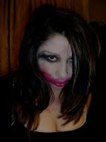
This image is a close up of the first model. The reason I chose to take a close up shot is because I wanted to be able to see the make-up clearly. The mise en scene shows that the magazine has a funky and young feel to it, the make-up is bright, colourful and vibrant which is perfect to appeal to my target audience of teenagers /young adults, the models hair is sleek and straight which gives her a sophisticated look. The lighting in the picture is normal and clear so you can see her make-up well, but the image was taken in a house therefore I chose not to use any of the pictures taken indoors because it doe not look that professional. The prop is a pair of headphones which make it clear that it is a music magazine, the models facial expression is relaxed and she has her eyes closed which looks like she is peacefully listening to music.


This is an image of the same model in a long shot image, I chose this shot so that the audience could see the model clothes clearly and also so that I could the props in properly. She is sitting down on top of the speaker and holding up a pair of headphones, this shows that the magazine is clearly a music magazine. Her make-up is bright and funky and the clothes she is wearing are sexy yet still sophisticated. The lighting is normal as it was taken outside which fits in with the hip-hop theme well as it look rough and has a 'street' attitude to it. I used Adobe Photoshop to change her eye colour but I thought this looked too 'fake' therefore I chose not to do this on any of my other images

The model changed into four different outfits, one of them was this casual urban hoody and leggings, this gives the image a laid back and casual feel. The image was taken in a house in the daytime therefore the lighting is normal but you can see everything clearly. The shot is a close up so that you see her facial expression and make-up clearly. The make up is glamorous and extravagant which gives the image a fun and funky look. The model is wearing 'bling' earrings to keep the urban theme going and her facial expression is a smirk which look cheeky but serious at the same time.

This was taken in the daytime therefore the lighting normal but you can see everything clearly. The make up here is toned down a little bit as the model is not wearing the false eyelashes the reason for this is she has 'bling' in her hair and if she had the eyelashes on also there would be too much to look at for the audience which would also look quite messy. The hair arrangement was made by me by sticking lots of big diamonds shapes together. In the video there is an image of me arranging the diamonds in the models hair. The model is also wearing earrings which shows some more 'bling' this all fits in nicely with the hip-hop theme. The shot is a profile close up to show the make up and facial expressions clearly, the models facial expression is serious which also fits in with the hip-hop look as sometimes hip-hop is linked with aggression. The outfit here is the fourth and most simple outfit, and black camouflage print hoody this gives the image a laid back feel.

This image was also taken in the daytime so the lighting is normal. The model has a strong pose to show that she is a strong and successful female, she is holding the prop which is a speaker very powerful under one arm as if to say she can 'handle it' giving her a tough look and she has headphones around her neck, both props make it clear that this is a music magazine. She has a smile but a stern look on her face which works well with the hip-hop theme. The outfit is very sexy yet still sophisticated. She is wearing an all black outfit which contrasts with the bright make up well, she is wearing a lacy top, 'wet-look' legging and high heels which look very classy but also 'ghetto'. The image was taken outdoors on a road which fits in with the hip-hop theme as it looks cool and has a 'street' attitude to it. The models head was in the bright light and unfortunately I didn't have access to a good quality camera, I think I could have achieved better quality pictures if I could have had a camera instead of using a phone. This isn't that much of a problem as I know how to solve this on photo shop and make the picture look more professional.

This image was taken in the house and the lighting is just normal but you can still see everything quite clearly. This is a strong image and the model has a stern look full of attitude. The shot is a mid shot so that you can see some of the outfit but also her face clearly. She is wearing a glittery black top which looks glamorous and sunglasses which give her a very 'cool' look, the mise en scene shows that this image is aimed at young, urban people because her make is very funky and you can a little bit of her eye make up even under the sunglasses which shows that her make up was big! Her lip-gloss is bright pink and girly and her hair is sleek and straight which gives her a sophisticated look, there is also a prop in the image as the model is wearing a pair of big headphones, this shows that the magazine is a music magazine.This image is not very good to use as one of my main ones because it is not that clear therefore I have chosen to use one out of my better images.