Sunday, 18 April 2010

Double Page Spread Ideas

I want my double page spread to look professional and appealing to my target audience, I will do this by using nice calm colours. I have chosen the colour scheme as mostly black, white, blue and grey as I think these colours look slick and stylish which will appeal to my target audience of teenagers and young adults and the colours will math the models clothes and keep the theme of the whole magazines colour scheme the same. I have two ideas of what I want my double page spread to feature; either an interview with a new upcoming hip-hop artist or an interview with a well established hip-hop superstar. The idea of an interview with a new hip-hop artist is good as the reader will be intrigued about the new artist therefore they will read the feature article, the other idea of an interview with a well known hip-hop icon is also a good idea as the audience will already know the artist and want to read the gossip about a recognised hip-hop icon.
I have created three different flat plans which you can view below, these are flat plans that I will be using to make my double page spread. They all have images on them and a feature article laid out conventionally. The double page spread will include a title, introduction, image with a quotation to grab the reader’s attention and draw them into the article and the images and text will be spread out equally as I do not want my readers to think there is too much text or too many images. Either idea that I go for the questions will be similar, for example "What can we expect from your new album?" and "How do you keep your swagger up?", this makes the interview fun and gives it variety which will be interesting to the audience.
The first idea is interesting, it is an interview with an established hip-hop artist. The artist will be asked similar questions about new singles, music videos, friendships, relationships, fashion, fights (beef), as the young hip-hop crowd are into this kind of gossip. I will also include dates of gigs and events the artist will be performing at because as they are new artist they will need to have publicity and it is good if they answer questions about when their next gig will be as the audience will want to attend it. I will also include information on live gigs and events that the artist will be performing at and also have a competition offer to win tickets to the next gig, this will make the readers want to try out to win the tickets. 
The second idea, which I believe is a better one as it will be a known artist so the audience do need much of an introduction and don't need to be persuaded to like the artist, is an idea of having an article with a well established hip-hop artist will include equal amount of images and text, the questions will be similar as they are interesting and appealing to my target audience, such as questions on new singles, music videos, friendships, fights (beef), relationships, fashion, ect. This will appeal to the target audience as the young hip-hop crowd are interested in such topics. This will appeal to the target audience as the young hip-hop crowd are interested in such topics. I will also include information on the artists next tour and also have a competition offer to win tickets to the tour, this will make the readers want to try out to win the tickets. 
The ideas are quite similar so either way the audience will be satisfied with the double page spread feature, I decided to use the one with the already established artist because I think my target audience will enjoy catching up with an old artist on the hip-hop scene.

Double Page Spread - Flat Plan 3

The third double page spread flat plan I created was the least conventional of a standard Hip-Hop/ R'n'B magazine as it is a little busy. The feature article includes two images of the artist, in both pictures she is wearing the same black, sleek and sexy top with wet look leggings and stiletto heels, the costume worn is very young and sexy yet sophisticated at the same time. The make-up and hair shows she is a pretty and young ’cool’ artist as the make up is quite unusual and stands out. The images have their backgrounds erased as I thought this would look different and make the image stand out more against the background I choose to use.
I will not be using this coloured background or this colour scheme, I just colour coded the boxes, text and made the background a standard colour to make it clearer to see everything. The title of the article is positioned conventionally at the top of the first page so that the audience can instantly see the title and underneath this is an image of the artist with a quotation across the image so that the reader will get drawn in instantly, this quote will be in bold letters to stand out. There is an introduction to the article on right hand side to the image so that the audience will get the chance to read a bit about the artist and what the article is about before they read on. I have placed the article on the other page with an image of the artist embedded in the article, this is so that the text is cut up a little bit and it doesn’t look a page full of text. The text will be in a conventional column style. The spine does not interfere with any of the text of images which is good as the reader won’t miss anything out that would be lost if the text overlapped the spine and the page numbers are in the bottom corners of each opposite page so that they can be seen clearly but still kept out of the way.

Double Page Spread - Flat Plan 2

The second double page spread I designed is very simple, typical layout, it easy to read but it can also come across as being a bit boring too  which made me consider if this double page spread is really good for my magazine. I wanted to keep it simple as it would be easier to see everything clearly. The article is on the first page and the image is on the other, the image has a quotation across it to draw the readers in because if they see a funny or interesting quote they will automatically want to read further. The image is of my first model, Rachel, her look is funky, fresh and young which fits my magazines theme and will also appeal to my target audience. The mise en scene shows that it is a funky young hip-hop magazine as her prop is headphones and she looks like she is enjoying listening to music, and her make-up shows that she is funky and young and cool as it is very young and artistic, the make up is also bright but I chose to change the image to a black and white image to make it different and look mysterious. At the top of the first page is the title of the article and an introduction to it
So that the audience can get a chance to read a bit about who the artist is and what the interview will be about. The page numbers are in the bottom of both page corners so that they are kept out of the way so they don't distract from the main image and the magazine article. The spine will not be interfering with any of the text because I have spaced the text out or image, the spine acts as a sort of divider for the text and the image.


This was the first draft of the flat plan where the image is in colour. As you can see the make-up is very bright and funky which gives the artist a young and also cheeky look as it looks playful and as if she is a very confident character.

Double Page Spread - Flat Plan 1

The first double page spread I created was quite a complicated layout. I included a montage so that the audience got to see a variety of images, there is also a big image on the second page of the double page spread this is so the audience can also see a close up of the artist and it also gives the pages some volume and a different feel. This image will have a quote across it to draw the readers in because if they see a funny or interesting quote they will be curious and want to read on. The images are all of the artist holding/sitting with props related to music either headphones or a speaker, this is to make it clear that she is a music artist. Her image is very young and funky as her clothes are sexy and her make-up is bright and vibrant. I choose to erase all of the backgrounds on each picture and make a montage because I thought it looks interesting and funky.
There is a small introduction to the article so that the readers can get to know a bit about the new artist and what the interview will have in store for them before they continue to read the article. The article itself is written in columns as I have shown with the boxes, this is so that it is easy for my audience to read and it doesn’t look like too much text if it is split into columns rather than just one big article. The colours I am going to use in the real double page spread will be more professional looking than the colours used in the flat plan, the reason I used these colours at the moment is to colour code everything included in the flat plan and make the plan look clearer. The magazine name and institutional logo is in the top left hand corner and the page number is in the bottom right corner, this is so that the audience are not distracted by these small details and so that they focus on the article and images. The spine does not interfere with any of the text or images which is good as it will easy for the audience to read and see everything clearly.

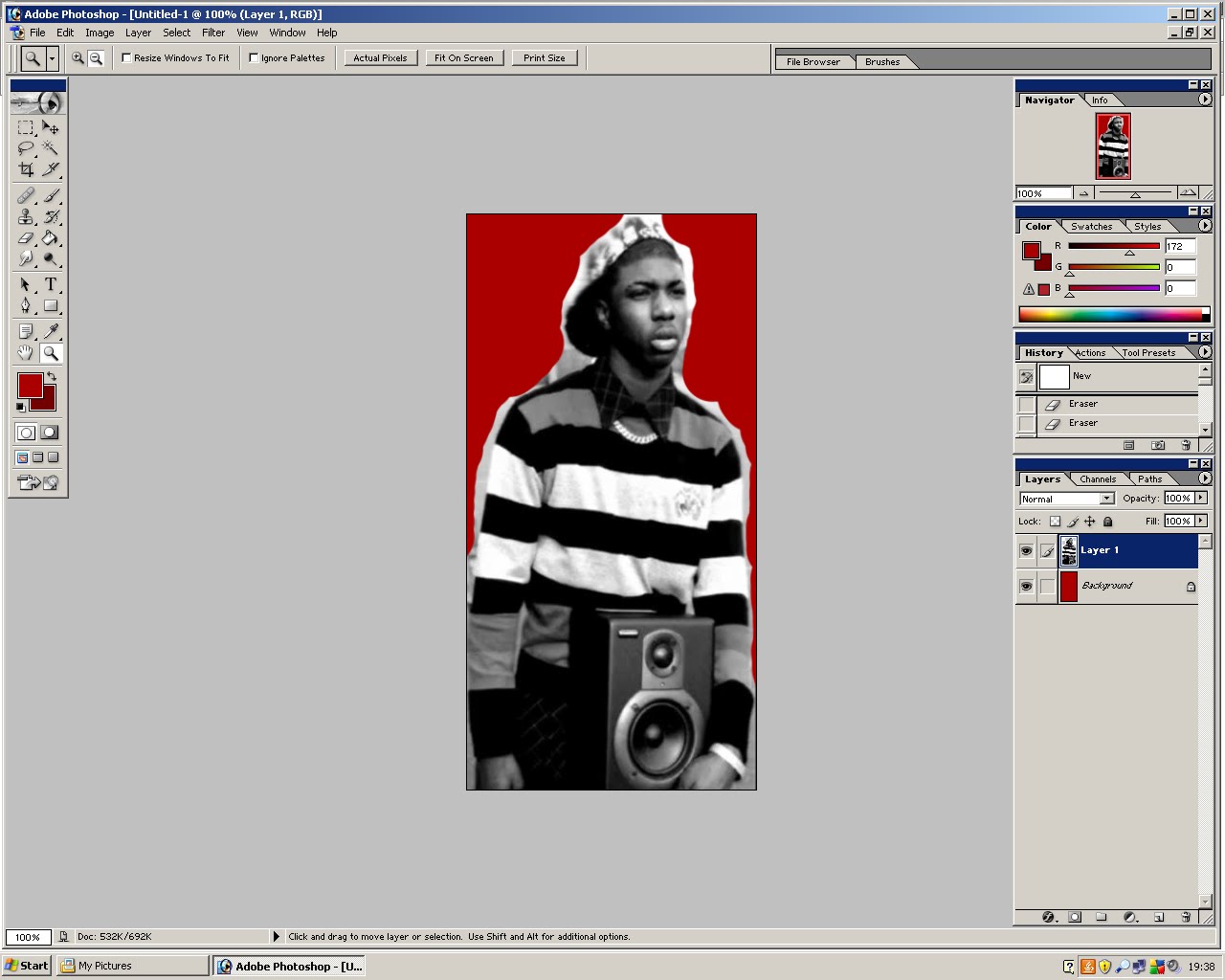
 This is a print screen shot of how I erased the backgrounds on the images for the montage.

Friday, 16 April 2010

Contents Page - Flat Plan 3 and four (the best)

My other flat plans for my contents pages didn't look as professional as they could have so I chose not to use them. When I arrived at school with the pictures I produced the whole class thought that this picture of my male model should have been the main focus of all the contents page flat plans rather than the girl, I also thought this because she had been featured mostly on all of the flat plans, therefore I have made an extra and final contents page flat plan:

I made this contents page flat plan on photoshop and it looks much more professional than my others as I didn't over complicate it and make it look too busy. It is simple yet really powerful, the image is very strong, hard and powerful too. The image is of a young, cool looking male, the picture has a lot of attitude as he is in a 'gangster' pose. The mise en scene shows that this is for a music magazine as the setting is in front of a wall which fits in with the theme and looks like he is very 'street', the clothes are smart yet still kept young and funky with the stripy jumper and chain which adds 'bling' into the picture. The page number is kept small in the bottom right hand corner so that it doesn't distract the audience from the image, which is the main focus. I added a bar at the bottom of the page as I thought this looked professional and added more colour to the page. The Features and page numbers are positioned on the left hand side and are kept subtle so that they do not distract the audience away from the image too much. The feature article is going to be about the male model, therefore I have put him as the main image on the contents page rather than the front page to challenge the convention as I think it is boring to always see the main article about the cover model. On the image there is text that says 'Is KR Saviour as hard as his image?' and the 6 in brackets referring to the page number. This is the title to the double page spread article therefore the audience can go to the page quickly because the page number is stated in brackets next to the title of the article. As there is an empty space in the top right corner, when I actually create my real magazine contents page I may add a button there which will be the same as the one on the front cover to remind the audience where to get the free mixtape.


This was the third and in my opinion best contents page flat plan that I created. There are two images on it so that it is kept simple and not too bust and there is a button on the female model's picture to remind the audience of the free mix-tape inside. This contents page is conventional and kept simple as are most hip-hop magazine contents pages. 'Contents' is on top of the features and page numbers which makes the page very simple and makes it easy to locate everything. There is a editors note on top of the female models image, this gives it a personal touch and let's the reader know what is going on this issue. The images are of two young hip-hop artists who each have props relating to music, the female has headphones around her neck and the male has a speaker. The mise en scene in both images portray a funky, fresh and young image which also looks urban and relevant to hip-hop, the male is wearing a smart shirt with a stripy jumper on top to give it a more laid back feel but still look smart, he is also wearing a 'blingy' chain to show a ghetto, gangster look and he is also sticking to fingers up which shows his attitude and looks 'cool' and 'ghetto'.The female has bright and vibrant make up and 'blingy' earrings to look 'ghetto', she has her hand on her face framing her left eye, this looks classy and draws attention to her eyes which are brightly and artistically decorated. The page number is conventionally kept out of the way in the bottom right hand corner so that it is not a distraction from the more important things such as the features and images.

Contents Page - Flat Plan 2

This contents page is unconventional and  quite unique. ‘Contents’ is written unconventionally on its side and there are four images which makes the page quite busy. There are two pictures of both of my models and they are placed in a quite of ‘window’ way. The male models images are both in grey scale and he is wearing a smart shirt and a stripy jumper on top to make look more laid back, he also has a ‘blingy’ chain on which gives a ‘ghetto’ look to the image which make it perfect for a hip-hop image. He is also wearing timberland boots which have a ‘hard, manly’ look about them, the prop he is using is a speaker which makes it clear the magazine is a music magazine and also gives the hint that he is an artist. The female model is young and wearing bright, colourful make up which looks funky and fun. She is looking up in one of the pictures and down in the other picture which looks cool as it looks as if she is looking at herself from both angles, she is wearing a hoody in the image which looks young and cool and it is a good look because most hip-hop fans like hooded jumpers although this can be a stereotype. All of the images have has their backgrounds rubbed out with the eraser tool on photo-shop as I thought this would give it a unique look. Underneath the images is a line or two on information about the cover article, it will say something along the lines of ‘Tee Tee- the new star who claims she is going to smash into 2010. Lets see what she’s got in store for us on page 12!’ It is a good idea to add this information as it may draw the readers in even more as they will want to read more about a new star on the hip-hop scene. Then underneath the information on the cover story is the features and pages numbers which take up most of the remaining space. The page number is kept small and in the bottom right hand corner so that is not a distraction from the main images and text.

Contents Page - Flat Plan 1


The first contents page I created was very simple and had two images on it as I didn’t want to overcrowd it with too many pictures. It is quite conventional with ‘contents ‘ at the top of the page on the left hand side so that the audience will be able to see it straight away, underneath this is an editors note, this is a good idea as it is a personal touch and let’s the audience know what the magazine has got in store for them this issue.  The features and page numbers are placed in a conventional place and take up quite a lot of room, this makes it clear for the audience to read. The images used are both in black and white (grey scale) because I thought this is an unconventional thing to have in a magazine and I wanted my magazine to be different and unique. This contents page will appeal to my target audience as it looks young and has a cool laid back look to it. There is a subscription offer underneath the male models image, hopefully this will catch their eye and therefore more people will subscribe to the magazine as they will feel that they can save money this way. The page number is kept out of the way in the bottom right hand corner conventionally as it is not a main thing that the audience will need to look at.

Print screens of how i made flat plan contents page 1

This is the original image that I took The image was taken in black and white (grey scale effect on a 'Sony Ericsson' phone). I started smudging out the background but this didn't look that professional so I thought it would be better to use the eraser tool and erase the whole background.


I started rubbing out the background and to do this in a way that I would be able to rub out the background completely I made a new layer and filled it in red to make sure I could see the small detail of background that needed to be rubbed out around the model.

As you can see there are cloudy areas around the body of the model, I changed the red background to maroon so that I could see the cloudy areas even clearer and therefore rub them out.


This is a print screen shot of when I had finished rubbing out all of the background.

I then got rid of the maroon layer and added back the other layers of my text and boxes.

I added my other model's picture into the contents page, I had also rubbed out the background in the same way so I didn't think it was necessary to print screen all of the steps again as you can see I know how to rub the background out. 

I free transformed both the images to make them fit into the page nicely.

I made a duplicate layer of the female model so that I could make her face black and white by lowering the saturation to -100, I did this so that on the other duplicate I could make her make up stand out against the black and white image thus making it more dramatic.

This is a print screen shot of the other duplicate layer on top of the black and white layer, showing the colourful make-up and making it stand out.

 Then I changed the hue and saturation to make the make-up look brighter, and I also made the black and white layer darker by changing the levels this made the contrast stronger.


Finally I filled the background in purple to make the flat plan look better.

If I end up using this layout as my final one I will make the background a different colour and make it look more professional, this was just a rough flat plan to show an idea of what I may want my contents page to look like

Wednesday, 14 April 2010

Magazine Cover - Flat Plan 3

The third layout is also simple and has certain conventions of a hip-hop magazine. The skyline will have celebrities names on it and the banner will be what the issue will feature, this is a convention of a hip-hop magazine. The bar-code is not on the front because from research I have found out that some magazines do not have bar-codes on the front some have the bar code on the back. The website is at the bottom of the page on the left hand side so that it not a distraction. The masthead is positioned at the top of the cover in the center, it is in front of the image which will make it clearer for the audience to read, under the masthead the dateline and issue number is placed on the left hand side, they are kept small therefore they will not be a distraction from the image and the kickers which are more important for selling the magazine. The image is a profile close up of the model, the model is looking at the camera but as is a profile picture the audience do not get the full effect of the make-up therefore I will not choose this image my final cover, the make up is bold and funky as this is what the target audience like, I know this because of the survey I distributed. The kickers are placed on the left hand side and they do not take up all the space therefore I do not think this layout is as good as my first one, therefore I will not use this layout as my final magazine cover layout.

Magazine Cover - Flat Plan 2

The second layout I create is simple and follows certain conventions of a hip-hip magazine such as the image used is of one model and this is the main focus of the magazine, the image has an anchor which makes the audience intrigued about the model therefore they will want to read more. The kickers are all positioned on the right hand side which is unconventional but I have positioned them like this to make the cover look simple and not too busy. The masthead is positioned on the top but left hand side as opposed to the center this is unconventional, The issue number is underneath the masthead and is kept small so that it is not a distraction, the date line is positioned on the left hand side underneath the masthead and is also kept small for the same reason. The bar-code is in the bottom right hand corner therefore it will not be a distraction, this is good as the audience should concentrate on the more important things on the magazine such as the image and the kickers. The magazine cover has a skyline and a banner which will let the reader know a bit more about what and who the magazine features, the skyline will have celebrities names on it and the banner will have what the magazine is about: 'The best in Urban Entertainment- Music, Gossip, Fashion, News and Reviews'.

This magazine cover layout was not the best choice as it doesn't follow all of the conventions of a hip-hop magazine and there are some empty spaces which I felt did not look that professional therefore I did not choose this layout for my magazine. 

Magazine Cover - Flat Plan 1

This layout follows the codes and conventions of a hip-hop magazine as the layout is quite simple. The layout includes a skyline and a banner at the top and bottom of the page which will include names of celebrities that are featured in the magazine this is a good idea because if the audience is drawn in by a celebrity that they like then they will automatically want to buy the magazine. The masthead is big and bold and it is behind the model which shows that is a well known magazine and doesn't need to show the name of the magazine for the audience to know what it is, there is a selling line underneath the masthead which is good as the audience will know what the magazine is about straight away.  I have made my models make-up young, funky and colourful as the survey results suggested that this is what my target audiences prefers, the model has props with her that are related to music (a speaker and headphones) this makes it clear that my magazine is a music magazine. There is an anchor which is positioned at the top left hand side of the page this will draw the audience in as it is quite big and in an eye-catching position.

There is a button on the right hand side which will say 'Free Mixtape Inside', this will encourage the audience to buy the magazine as they will feel that they are getting good value for their money and in my survey the results showed that my target audience prefer freebies. Conventionally there are kickers on both sides of the cover but they are mostly on the left hand side as the left third is most pleasing the human eye as I know from photography. The magazine website is positioned at the bottom left hand side, this is so that is does not become a distraction and the bar-code is positioned on the bottom right hand side for the same reason. They are both kept out of the way so that the audiences main focus can go on the kickers and the image which are the most important parts to sell the magazine.

Conventions of R&B/Hip-Hop Magazines


There are many common conventions which Hip-Hop Magazines have:

  • The background is usually plain and simple (not busy and packed)
  • The masthead is usually a bold and simple font  positioned at the top of the page
  • The masthead is usually behind the image 
  • Conventional colours are used (black, white, red) 
  • The main cover line is usually connected to the model
  • Text is simple yet bold to make it stand out
  • Cover lines are positioned on both sides of the page (left and right)
  • There is usually only one model used for the front cover with all the focus on them
  • There is usually and even amount of text and image used on a double page spread
  • Contents page is kept simple with one image and features 
  • The contents page usually has simple colours  too
  • The double page spread contains images and text (evenly amount)

Saturday, 3 April 2010

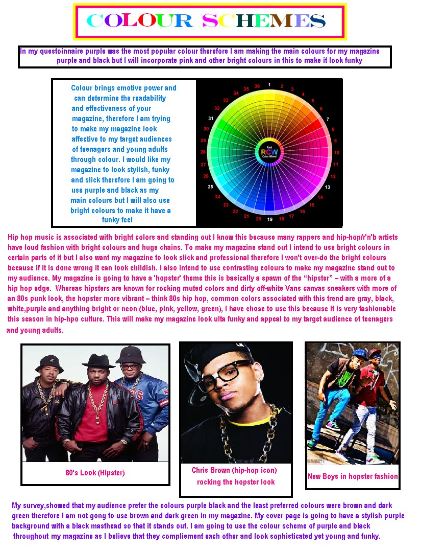
Colour Schemes For Magazine

Ideas of hooks, teasers, cover lines and buttons

The hooks, teasers, buttons and cover lines that I will use for my magazine will be interesting for my target audience as they are hip-hop fans. The target audience is teenagers and young adults therefore I will include celebrities that they will be interested in. The hook is “get the low down on all things hip hop” (‘low down’ means latest  information in urban slang) , the masthead is ‘Sub Low’ therefore it is using word play which makes the hook catchy. The hook will make the consumer want to buy the magazine as they will be curious about what is happening in the hip-hop scene if they are true hip-hop fans.

The kickers of my magazine will appeal to my target audience as in my survey the people said that they would like the magazine to feature interviews and celebrity gossip. The kickers are “Exclusive! KR Saviour returns, Is he as hard as his image”, "Nicki Minaj- How to get my barbie swagger" and "20 Hottest Summer Singles” These kickers will persuade the consumer to purchase the magazine as they will want to read more and know all the celebrity gossip on the celebrities being interviewed and they will also want to know the latest singles that have been released. The word ‘exclusive’ makes the magazine seem special and as if you can not get the interviews anywhere else therefore it is an incentive to buy the magazine.

The buttons that I can use for my magazine are freebies as my survey showed that my audience would be attracted to freebies. This is a common convention which buttons are used for which has a huge impact on sales. The ideas of freebies I came up with are “Free £10 HMV voucher” and “Free Mixtape inside”. The audience will love the idea of a £10 HMV voucher as they can buy their favourite CD or poster or whatever they wish, this gives the reader an incentive to buy the magazine as they will feel like they get a choice of what they can buy at HMV with the voucher, the second idea for the button is “Free Mixtape inside which will also be an incentive to buy the magazine as the reader will feel that they are getting more for their money as the mixtape Cd will probably be worth around £7 therefore to get it free will seem very appealing as the magazine is only £1.50. I have decided that  a free mixtape will help sales more as the consumer may not like going shopping and it is more effort for them to go and get their CD themselves.

The cover line is a very important part of the cover as it will be the main thing that will appeal to the audience on the page , the two ideas I have come up with are:

Tee Tee- “I’m bout to smash into 2010”, this will also be a model credit which shows who Tee Tee actually is. This cover line is effective as the consumer will want to know who ‘Tee Tee ’ is as she is a new artist, the fact that the cover line is in slang will appeal to the audience as the target audience are young hip-hop fans they will understand it. The cover line will persuade the audience to purchase the magazine as they will want to know who the latest upcoming star on the hip-hop scene is.

Mood Board 2

This was my first draft of a mood board but I felt that I could do a better one so I made a final mood board that looks much more professional

Hip-Hop Industry Mood Board 1


My mood board consists of many hip-hop images such as; Hip-Hop/R 'n' B artists, graffiti, streetwear, Hip-hop magazines, records, big flashy jewelry (aka bling) music hardware and urban culture inspired imagery. Think attitude, city, youth, style, music, and rap lyrics and you have Hip-Hop!

Thursday, 1 April 2010

Possible Fonts


In the end I thought that Reboard was the most stylish and appropriate font for my magazine and I beleive that my target audience will like it as it suits the hip-hop theme.

Possible Mastheads

Photography Research

Wednesday, 31 March 2010

Thursday, 25 March 2010

Questionnaire (Primary Research)

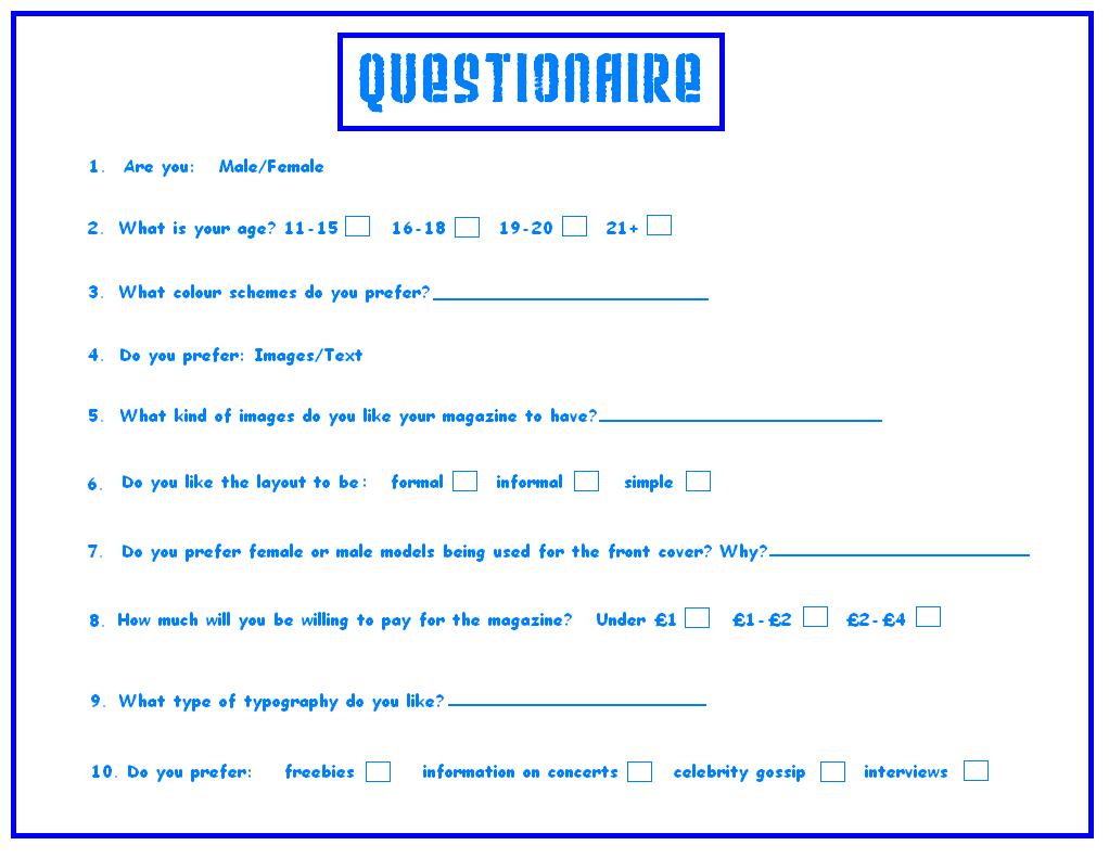
I have created my own questionnaire in order to find out what my target audience want and expect from my magazine. My primary research will help me make more profit as by knowing what my customers want I will be able to make my magazine better to suit the needs of my customers therefore they will buy it.

Audience Theory - Hypodermic Theory


There are other theories which are more modern, such as the the Uses and gratification theory (1974) by Blumler and Katz, unlike the hypodermic needle theory this theory is not passive. It includes four main characteristics, it looks at Diversion in media- escape from everyday life this can be through films and dramas ect, personal relationships - using the media for emotional and other interaction this can be through social networking sites ect, personal identity- finding yourself reflected through texts, learning behaviour and values from text this can be through music or soap operas and through surveillance- information which could be useful for everyday life, for example news reports, financial news, ect.

Introduction to main task

Double page spread (The Saturdays)

RWD Double Page Spread Analysis

Thursday, 18 March 2010

3 Hip-Hop Front Cover Analysis'


3 Rock Front Cover Analysis'

These were the first front cover analysis' I created in class were all on a famous rock magazine called Kerrang, but I felt that I should really make other ones as I decided I wanted to make a Hip-Hop magazine rather than a Rock magazine, the second reason I decided to make new ones is that I did not use all of the correct terminology in these front cover analysis' therefore in my Hip-Hop analysis' I chose to make them look more professional and I used all of the correct terminology. And the third reason was that I did these analysis' all on the same magazine and I thought it would be better to have three different magazines to show variety in my work.

When I took pictures of the analysis' it didn't come out clear and I could only access an A4 photocopier; this is why I scanned the A4 analysis and took a picture of the A3 to show my creativity.


Contents page mock up


Thursday, 11 March 2010

Thursday, 4 March 2010